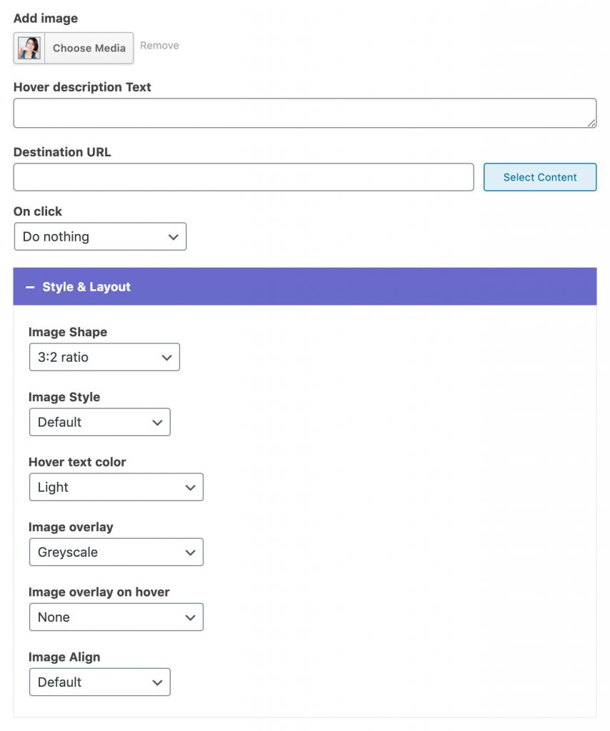
Image Widget Add an image with optional text on hover. Widget Options Add image: Choose an image from the media library or upload a new one.* Hover description text: You can enter description text that will appear on hover. Destination URL: Enter a link or select a page. This is optional. On click: You can set the image to be opened in a lightbox, open the provided link, or to do nothing. Style & Layout Image Shape: You can choose between different image shapes: circle, square, portrait, 3:2 ratio, 750px width, and Original image ratio.* Image style (Dentalia 2.0+): You can add Shadow or a Frame to the image. Hover Text Color: You can choose from predefined theme colors. Image overlay and image overlay on hover options allow you to add color overlays to your images. Image align (Dentalia 2.0+): Images can be aligned left, right, or center. *Images should be at least 750x750px in size to be cropped properly. Example A (default) Example B (customized) Example C (customized) Example text

