Editing Rows
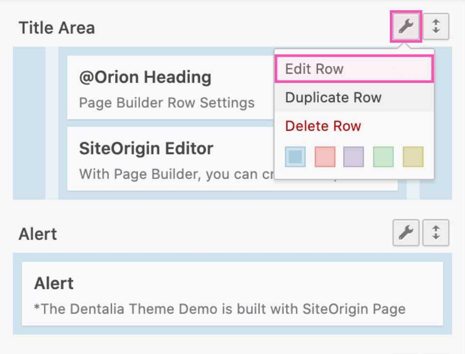
Page Builder row settings are accessible by clicking the wrench icon above each row.
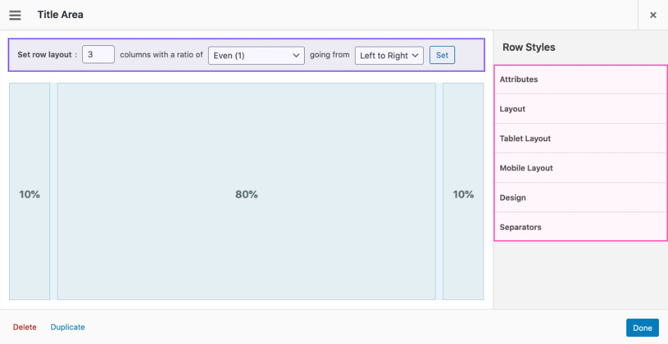
Adjustments to the row layout (number of cells) can be made in the horizontal bar.
Style settings are located in the right-side panels.
Below we cover only the options specific to the Dentalia theme. These were developed by our team and are not default to SiteOrigin Page Builder.
1 Desktop Layout
- Row Layout
Besides the default Page Builder Layouts (Standard, Full Width, Full Width Stretched, and Full Width Stretched Padded) we added the options Sterched Left and Stretched Right (Dentalia 2.0+). This will stretch half of the row, while the other half will fit the standard container. - Collapse Behaviour
This option was introduced with Page Builder 2.5. We added an option to force collapse the row on medium screens (for example on iPad Pro). - Row Position
This option will push-up the row (on desktop and tablet) and make it overlap the row above. - Desktop Display
You can hide the row on large screens and force the number of cells the row has on the desktop. This is needed only in specific cases, so use it with caution. - Full-screen row height
Check to set the height of the row to be equal to the height of the screen.
Row Layout Examples
4 Row Design
- Background Color (Dentalia 2.0+)
You can pick and instantly apply theme colors to the row background. To use a custom color, click the Rainbow 🌈 and add your color in the color picker field. - Overlay
Add a color overlay over the row background. The colors and gradients are defined by the general theme colors set in the Theme Options. - Text color
Sets the text color in the row to light or dark (affects all widgets placed inside the row).
Row Design Examples
5 Separators
Section separators can be added to page builder rows and thus make a fine transition between different sections.
Each row can have a top and bottom separator, which can be placed inside and outside the row. The separators look best when applied to Fullwidth or Stretched rows.
Top separator settings
- Top separator
Choose the style of the separator that will show on the top of the row. - Top separator position
Places the separator inside or outside of the row. - Top separator color
Set the separator color to match the row background.
Bottom separator settings
- Bottom separator
Choose the style of the separator that will show on the bottom of the row. - Bottom separator position
Places the separator inside or outside of the row. - Bottom separator color
Set the separator color to match the row background.
Additional options
- Animate separators
Makes the separators appear more smoothly. - Disable responsive scaling
Removes the scaling effect and the separator retains its size on all screens. - Display Separators on mobile
Allows you to hide the separators on mobile devices.


