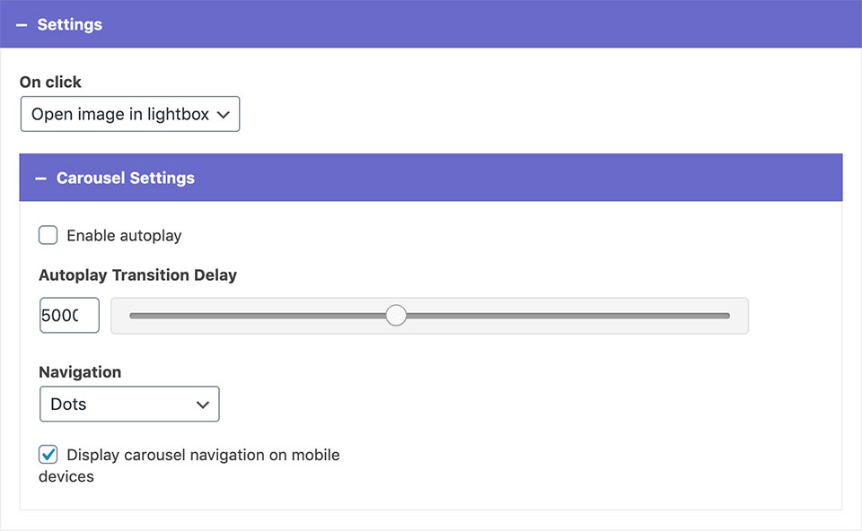
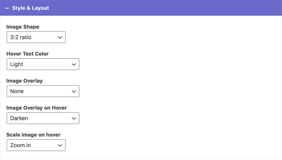
Gallery Widget Display a gallery of images in a grid or carousel with optional description on hover. 1 Adding Images: Add+ adds a new element to the widget. Upload an image: Choose an image from the media library or upload a new one. Text on hover: You can enter a description text that will appear on hover. Admin Label: You can label your image here. This is for back-end only and will not show on your site. 2 Widget Options Elements per row: Sets the number of images shown in the same row on desktop. Choose layout: You can choose between the grid and the carousel layout. Widget title color: Choose whether the widget title is dark or light. Settings On click: You can set the images to open in a lightbox or do nothing. If you picked the carousel layout, you can enable autoplay, adjust its transition delay, and choose between different navigation styles. Unchecking the display carousel navigation on mobile devices will hide the navigation on mobile. Style & Layout Image Shape: You can choose between different image shapes: circle, square, portrait, 3:2 ratio, 750px width, and Original image ratio.* Hover Text Color: You can choose from predefined theme colors. Image overlay and image overlay on hover options allow you to add color overlays to your images. Scale image on hover: You can choose between zoom in, zoom out, or none. *These options will crop the images into uniform shapes. If you want to retain the original image ratios, chose the Original image ratio option. Example A Example B Children's dentistry Dental Implants Dentures Prevention Crowns & Bridges Example C


