Display logos, certificates, or similar content in a grid or carousel.
1 Adding Logos
Add+ creates a new element.
Logo Title: This will be only visible in the admin panel.
Choose a logo from the media library or upload a new one.
Logo Link: Add the destination URL to the logo.
Link Settings
You can have the link open in a new tab
You can add a no-follow attribute for SEO.
Advanced Settings
Custom HTML class: Allows you to style the element with CSS.
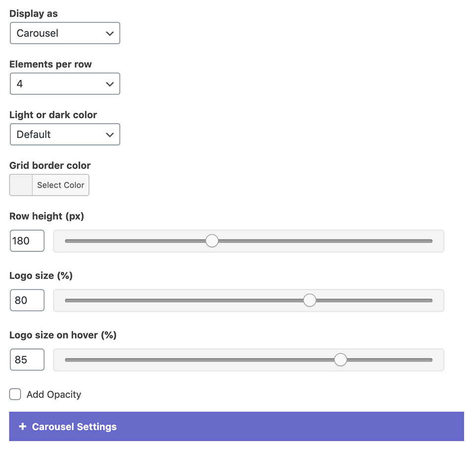
2 Widget Settings
Display as: Choose between a grid or carousel layouts.
Elements per row: Sets the number of logos per row on desktop.
Light or dark color: Affects the widget title and the navigation color.
Grid Border color: The color of the border between the logos. Works with the grid layout.
Row height: Sets the height of the row in pixels.
Logo size and logo size on hover: You can set how much space should a logo take up inside the row. Having different values will animate the logos on hover.
Add opacity (Dentalia 2.0): If checked, the logos will appear slightly transparent until hovering over them.
Carousel Settings
If you picked the carousel layout, you can enable autoplay, adjust its transition delay, and choose between different navigation styles.
Unchecking the display carousel navigation on mobile devices will hide the navigation on mobile.

