Featured Pages Widget
The featured pages widget displays a selection of pages in a grid or carousel with their excerpts and featured images.
1 Adding featured pages:
- Add+ adds a new page to the widget.
- Choose page by title: Select a page from the list.
- Select an Icon (optional): You can add an icon to the element.
- You can change the color and the background color of the icon.
Override Content*
- Custom image: Overrides the featured image.
- Custom title: Overrides the page title.
- Custom excerpt: Overrides the excerpt text.
*By default, the widget will show the page titles, excerpts, and featured images of the selected pages. These elements are set on their respective page edit screens. Since Dentalia version 2.0, you can override them directly inside the widget.
2 Widget Settings
- Elements per row: Sets the number of pages shown in the same row on desktop.
- Choose layout: You can choose between the grid and the carousel layout.
- Text color: Select whether the text is dark or light.
- Align elements (Dentalia 2.0+): You can align the elements left, right, or center.
Advanced Layout Settings
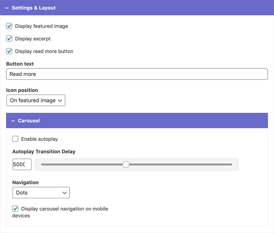
- You can choose to hide elements by unchecking the Display features image, Display Excerpt nad Display read more button options.
- Button text: You can override the "read more" text here.
- Icon position: You can have the icons displayed on the featured image, or next to the page title.
Carousel
- If you picked the carousel layout, you can enable autoplay, adjust its transition delay, and choose between different navigation styles.
- Unchecking the display carousel navigation on mobile devices will hide the navigation on mobile.
3 Styling Options
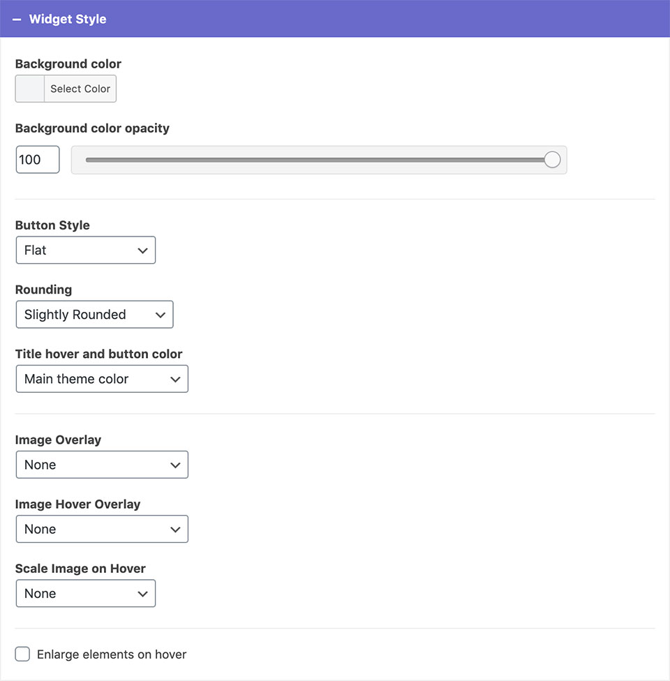
- Background color and opacity
Sets the background color of the elements. - Button style and rounding (Dentalia 2.0+)
Allows you to customize the shape and style of the read more buttons. - Title hover and button color
You can choose from predefined theme colors. - Image overlay and Image overlay on hover
You can add overlays to the featured images. - Scale image on hover
You chose between zoom in and zoom out. Setting this option to none will remove the animation.* - Enlarge elements on hover
Checking this option will add animation to the elements on hover.*
*Enlarging elements on hover and having image zoom on at the same time can sometimes cause glitching. To avoid this, better use these options separately.
Typography
- The typography settings introduced in Dentalia 2.0 allows you to adjust the title size and make the headings appear bold and/or uppercase.
Example A (Default)

Features Widget
Display animated features in a grid. You can use this widget to display featured services, contact information, and similar content....

Button Widget
With this widget, you can add buttons anywhere on your website. Button text The text that will show on the...

Before/After Slider
The widget takes two images and compares them by moving the borderline that gradually hides one image and shows the...


