You can add and edit team members in WP Dashboard - > Team.
If you don't want to add team members separately, use the Small Team Widget instead.
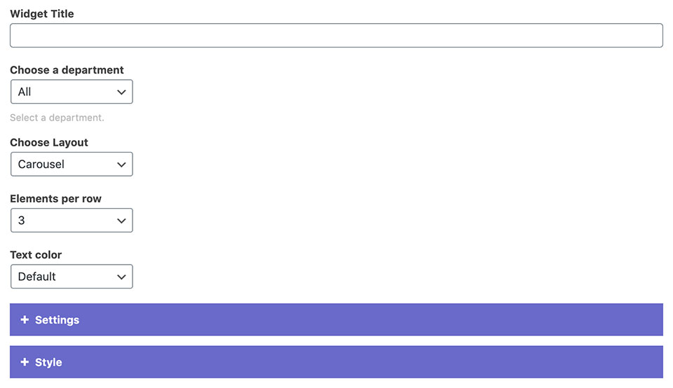
1 Widget Options
Choose a department: You can filter which team members will be displayed depending on their department.
Layout: Choose between grid or carousel layout.
Elements per row: Sets the number of team members in a row on desktop.
Text color: Sets the text to light or dark for the entire widget.
Settings
Ordering: Choose the two parameters by which the team members will be sorted (ascending/descending).
Display department, intro text, and social icons: Check which information should be included.
Carousel Settings
If you picked the carousel layout, you can enable autoplay, adjust its transition delay, and choose between different navigation styles.
Unchecking the display carousel navigation on mobile devices will hide the navigation on mobile.
2 Style Settings
Image Style: You can choose between different image shapes: circle, square, portrait, 3:2 ratio, 750px width, and Original image ratio.* Selecting none will hide the images.
Hover color: You can choose from predefined theme colors.
Background color and its opacity: Adds background to the elements.
Image overlay and image overlay on hover options allow you to add color overlays to the featured images.
Scale image on hover: You can choose between zoom in, zoom out, or none.
Add border: Adds a thin border around each element.
*Images should be at least 750x750px in size to be cropped properly.