Mobile Header
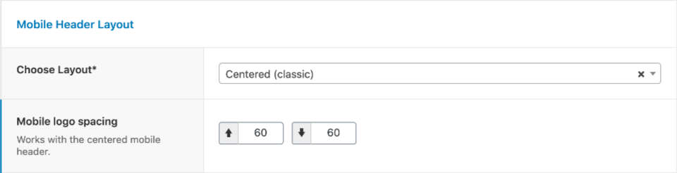
In this section, you can customize the layout and style of the mobile header. The options were added to Dentalia theme version 2.0.
Theme Options -> Header -> Mobile Header
Mobile Header Layout
- Choose Layout: You can choose from Centered (the menu icon is centered below the logo), Compact (the menu icon is placed on the right side, and the logo is aligned left), and Sticky (compact layout and remains visible on scroll).
- Mobile Logo Spacing: You can adjust the spacing of the logo when the Centered mobile header is selected.
Call Icon on Mobile
- Phone number for call icon: Entering a number will add a Call icon to the mobile header. Leave it empty, if you don't want the icon to display.
Header Type Specific Settings
Classic Header Mobile Adjustments
-
Header Widgets Mobile Visibility: You can set how the classic header widget area appears on mobile. It can be displayed inside the mobile menu, below the mobile menu (visible to visitors), or you can hide it on mobile.
- Mobile Header Widget Area Padding: This option is available when the widget area is placed below the mobile menu.
- Mobile Header Widgets Text Color: You can adjust the text colors of the widgets on mobile.
- Classic Header Mobile Logo Color: You can set which logo (light or dark) should be used on mobile.
Example (Centered Mobile Header)

Example (Compact Mobile header)
