Features Widget
Display animated features in a grid. You can use this widget to display featured services, contact information, and similar content. Each element can be styled individually.
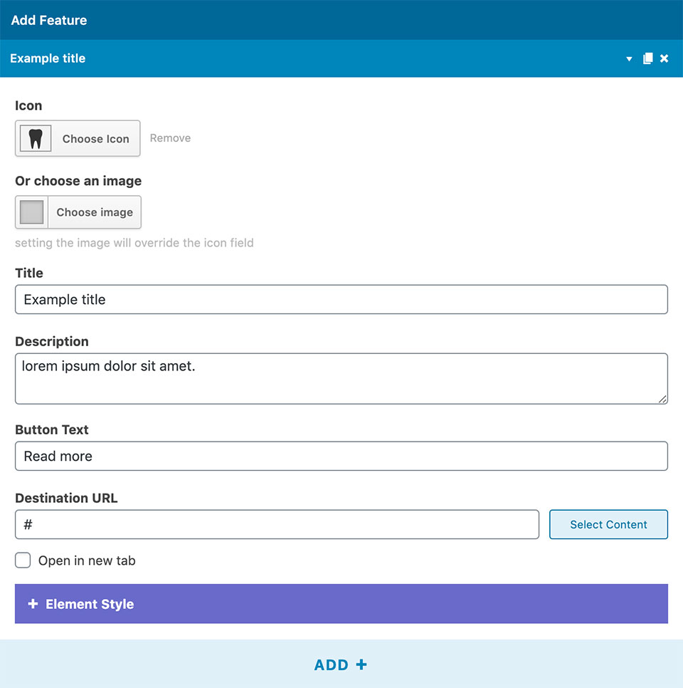
1 Adding features:
- Add+ creates a new element. You can add any number of feature panels to the grid.
- Icon: Add an icon to the feature.
- Choose an Image: This image will be displayed instead of the icon.
- Title: Displays the feature title.
- Description: Adds a short description of the feature.
- Button text and Destination URL: Adds a button to the feature that leads to a set page.
- Open in a new tab: Check to open the button link in a new window.
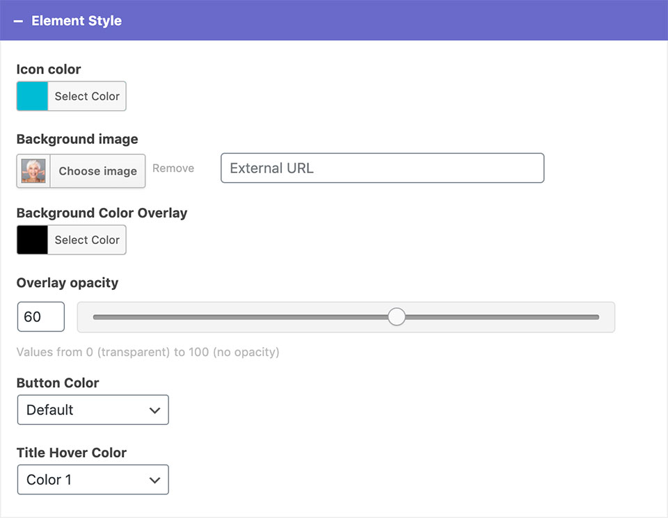
Element style
- You can change the icon color of the selected feature.
- Background image: For the background, you can set an image from the media library or upload a new one. The image will enlarge on hover.
- Background color overlay and opacity: You can customize the background color overlay and its opacity.*
- Button color: Choose from theme defined button colors.
- Title hover color: Sets the color of the feature title while hovering over it.
*You can make the background transparent by clearing the background-color field.
2 Style & Layout Settings
- Elements per row: Sets the number of features per row on desktop.
- Row Height in pixels: The height of a row in the grid of features.
- Auto heigh on mobile (Dentalia 2.0+): Check for better fitting content.
- Text color: Sets the text color to dark or light for the entire widget.
- Text alignment: Aligns the elements to left, right, or center.
- Heading size and bold heading (Dentalia 2.0+): You can change the size of the titles and make them bold if you want.
- Icon size: Sets the icon size of all the features.
- Always show description: Check whether you want the feature description to be always visible.*
- Add border and border color: Check to separate the features with borders. Upon adding borders you can also change their color.
*Descriptions are always visible on mobile devices.
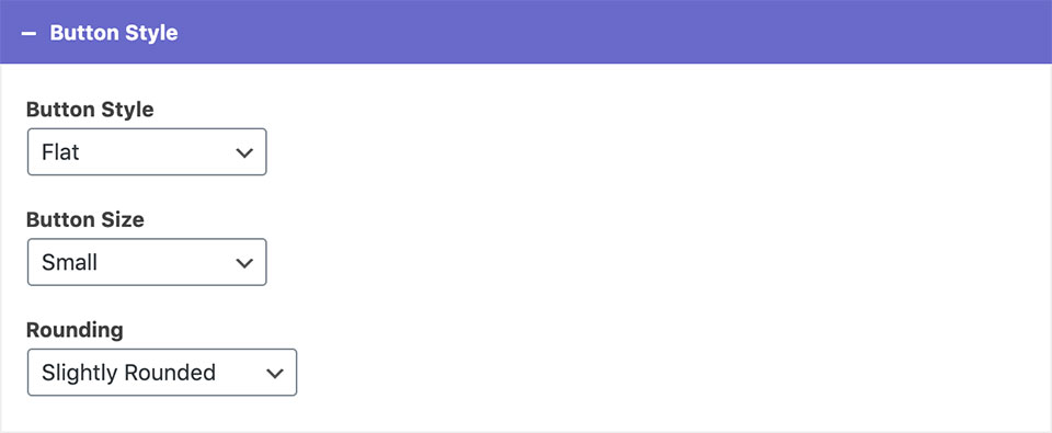
Button style
- You can change the style, size, and shape of the buttons. This affects the entire widget.
Example A
Example C
Responsive
Lorem ipsum dolor sit amet, consectetur adipiscing elit, sed do eiusmod tempor incididunt ut labore et dolore magna aliqua.


